Redesign of Sellpy application
Sellpy endeavors to promote a circular living style by facilitating a streamlined shopping and selling experience, with the primary objective of reducing waste and maximizing the utilization of pre-owned items.
"How might we redesign the Sellpy application to enhance user trust and streamline the user experience, ultimately boosting customer satisfaction and sales?"
ROLE
UX & UI designer, individual work
SCOPE
8 weeks
PROCESS
Research, interviews, competitive analysis, ideation, prototyping, testing.
TOOLS
Figma, Adobe XD, Miro
RESEARCH
Context
Just like many other young adults, I am a big fan of buying second hand items, which not only contributes to environmental sustainability but is also economically advantageous. However, the uncertainty surrounding the fit and quality of these items can be a source of concern. At times, it feels like purchasing second-hand items online is akin to a gamble. After using Sellpy's application, I realized that their intricate design and usability issues only exacerbated the problem for me.
User research
After conducting 5 user interviews, it became evident that the users were generally dissatisfied with the current application. They consistently encountered confusion and uncertainty while using the application, which frequently resulted in them abandoning their intended purchases and seeking alternatives on other websites/applications. Problems can be categorised in two large areas:
Design and aesthetics
Usability and customisation
User needs:
Flexible and clear design
All information should be easily understandable and clearly formulated, yet not overly verbose. Highlighting the core concept is crucial.
“When using the app, because the content name is too long, there will be a lot of "..." users have to click to open it to see the price, introduction or name, and some even if they click on it, there are only "..." at all.” (User A)
Usability
“There is an overabundance of simplistic fonts, and it would be beneficial to incorporate corresponding patterns before product names, use more robust fonts, or employ a combination of both.”(User B)
“when items are mistakenly marked as 'reserved' after removal from the cart, making it challenging to re-add them.”(User A)
Personalization
“The app’s home page could be more tailored to the user.”(User D)
Reduced complexibility
“The app struggles to reduce complexity, often attempting to present all information on a single page without achieving clarity which often leave users confused”(User C)
Structure
“Categories are scattered throughout the app without a cohesive structure."(User E)
Competitive & SWOT Analysis
The insights I gathered during my research helped me develop two personas:
Sofia - University student who lives on budget and loves thrifting and finding stuff that fits her.
Christine - Fashion passionate student who has certain taste of clothes and always wants to dress very stylishly, but can’t afford the high prices for brand new items.
EXPLORATION & IDEATION
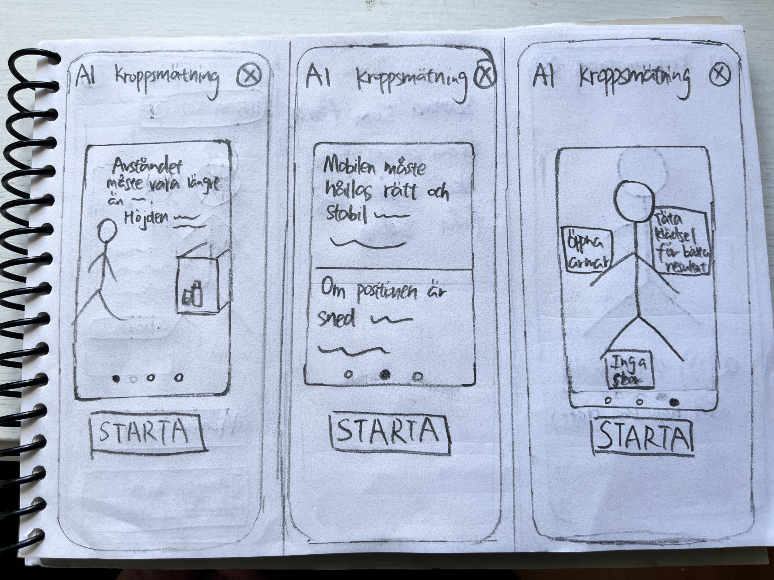
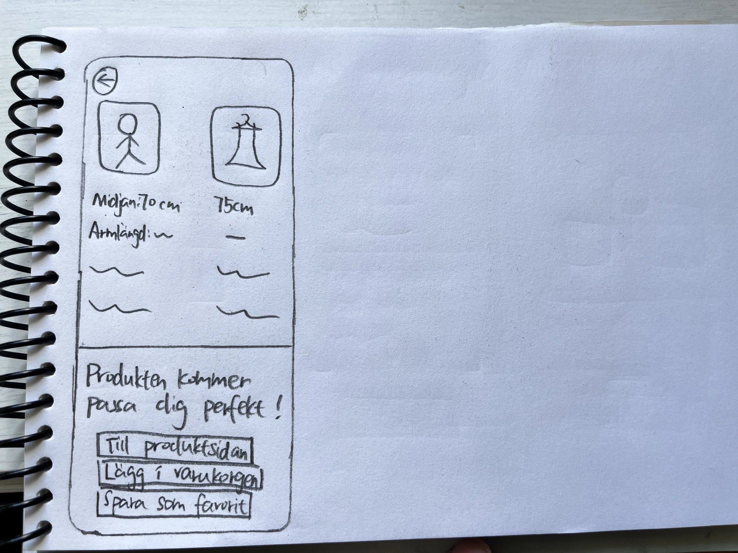
Throughout the research, I have gained a clear understanding of the new functions I intend to incorporate. I aim to empower users to search for products using images, enticing them with their favourite items at competitive prices and detailed information about their conditions. As a result, the inclusion of AI-generated body measurements within the application becomes imperative, alleviating their uncertainty regarding fit and providing users with a form of advance assurance. Moreover, enhancing the current version with a more intuitive and user-friendly design is equally vital to me.
With these main focus at the forefront of my mind, I created hand drawn sketches and built the first wireframes based on them.


Demo Video
Sellpy taught me
Designing solutions often involves making tough decisions. Sometimes, what's best for a business may not align perfectly with what users want. As designers, our challenge is to find that perfect middle ground where we can strike a balance between these two sometimes conflicting interests. This means we have to deeply understand not just the business goals but also the unique needs and desires of our users. It's in this delicate dance that we uncover that magical "sweet spot" where both the business and the users can benefit. It's like finding the perfect compromise that makes everyone happy and achieves the best outcomes for all parties involved.
Establish a solid foundation through patience. In the fast-paced world of work and deadlines, whether it's our own plans or project requirements, it's easy to lose sight of the importance of taking the time to truly understand your users and build a solid foundation. Sellpy has taught me e that instead of rushing into the visual aspects after a brief understanding, sometimes it’s better to pause, invest time in comprehending users on a deeper level, and even be willing to extend deadlines when necessary. This approach ultimately results in a more meaningful and valuable product for the end-users.


